Make the brand memorable
Give the restaurant a distinct first impression rather than an interchangeable food-service template.
Restaurant Website Design & Development
A restaurant website designed to put the food, the menu and the next order in one clear, distinctive customer journey.
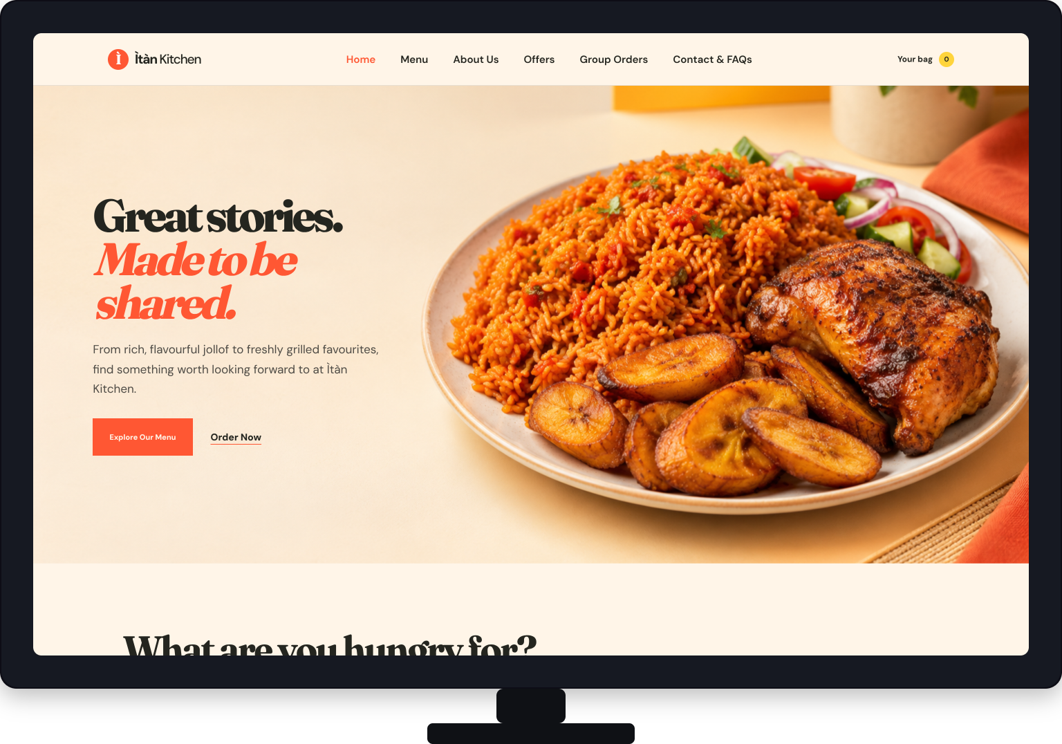
Project introduction
Itan Kitchen is a restaurant website project built around the way people choose where and what to eat.
The website gives the brand a focused online home: a clear first impression, an easy route into the menu, and visible ways to move from interest to an order or enquiry.
For a food business, the website has to make the offering feel worth exploring before it asks someone to take action. That meant giving food photography room to work, keeping the main routes simple, and making the next step easy to spot.
It also reflects Drey Studio's broader approach to website development: build the visual idea around a real customer journey.
The business challenge
The site needed to give a food brand a recognisable digital presence while helping visitors understand the offering and decide what to do next.
Give the restaurant a distinct first impression rather than an interchangeable food-service template.
Make it easier for visitors to find the food offering and understand what is available.
Keep the move from browsing to an order or contact action direct and easy to understand.
Keep the main story, menu entry point and customer actions usable when people are browsing on a phone.
The strategy
The website is organised around a simple restaurant journey, with each stage answering the next question a potential customer is likely to have.
A food-led hero introduces the restaurant and sets a clear, warm tone straight away.
Navigation gives visitors direct routes to the menu, offers, group orders and more about the restaurant.
Large food imagery and a menu-focused route help customers move from general interest to a more specific choice.
Visible order and contact actions give people a clear path when they are ready to take the next step.
Website experience
Instead of separating brand story from food discovery, the interface uses the same page hierarchy to make the experience feel connected.
Design direction
The visual direction lets the restaurant's own presentation do the work, while Drey Studio's case-study environment keeps the project story consistent with the rest of the portfolio.
Large, appetite-led imagery is balanced with generous space and short copy. The result gives visitors a clear sense of the restaurant before they need to make a decision.
Features and navigation
The visible navigation and calls to action give the restaurant's customer journey a clear structure.
Menu is a primary navigation item and the homepage gives it a prominent entry point, helping visitors move quickly into the food offering.
An Order Now action stays visible in the main hero, so the site does not make a ready customer search for the next step.
About Us, Offers and Group Orders give customers useful routes beyond the standard menu path.
A dedicated Contact & FAQs route gives visitors a clear place to resolve questions before they make a decision.
Responsive experience
The layout keeps the restaurant's visual character intact across desktop, tablet and mobile, while making the main route into the menu and order journey easy to find.
Project outcome
The completed website gives the brand a dedicated place to tell its story, present the food and make the customer’s next action easier to find.
Itan Kitchen now has a structured restaurant experience that brings its brand presentation, menu discovery, offers, group orders and customer contact routes into one website.
The work is designed to help a potential customer make sense of the restaurant quickly, then move forward when the time is right.
Delivered work
The project brings together restaurant website design, food-led visual presentation and a practical route toward customer action.
A clear first impression that introduces the restaurant and places the food at the centre of the experience.
Direct pathways to Menu, Offers, Group Orders, Contact & FAQs and other key customer information.
A visible order route that sits within the first screen rather than being hidden deeper in the experience.
A connected presentation across desktop, tablet and mobile screen sizes.
Drey Studio can help you present your food, make the menu easier to explore and give customers a clearer reason to take the next step.