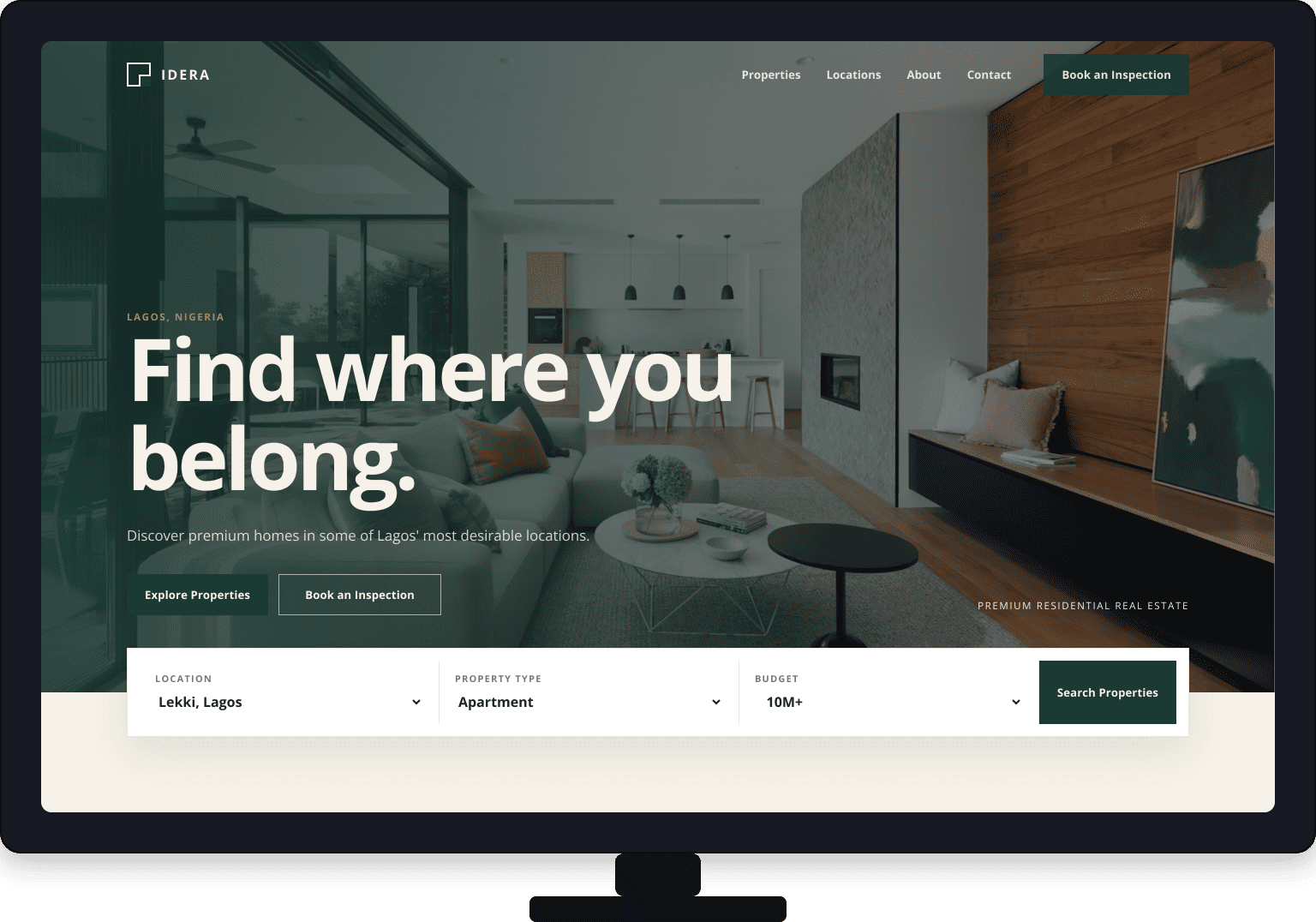
Make the first impression count
Present IDERA as a premium residential brand before the visitor has to compare a single property.
Real Estate Website
A premium residential property experience designed to make discovery feel clear, visual and intentional.
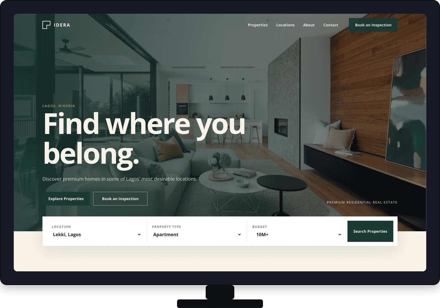
Overview
IDERA is a modern residential property brand built around the way people actually search for a home.
The website brings featured properties, locations, categories and lifestyle browsing into one calm, premium experience. It gives the visual story of each home room to breathe while keeping the next step close at hand.
From the first scroll to booking an inspection, every part of the journey is designed to feel considered rather than complicated.
The challenge
A real-estate catalogue can show plenty of homes and still leave people unsure where to begin.
Present IDERA as a premium residential brand before the visitor has to compare a single property.
Let visitors start with a featured home, a location, a property type or the way they want to live.
Move naturally from browsing to property details, then from interest to inspection.
Carry the same calm hierarchy across desktop, tablet and mobile screens.
The approach
Instead of adding more words, the experience uses scale, imagery and a clear sequence to help people decide what matters next.
A strong opening image and focused message establish the feeling of the brand immediately.
Featured homes, locations, categories and lifestyle cues make browsing feel natural.
Property information is paced so visitors can build confidence without being overwhelmed.
Explore Properties and Book an Inspection stay visible as useful, low-friction next steps.
Design System
Every design decision was intentional. The visual system gives the property imagery room to lead while keeping the experience warm, clear and easy to trust.
Arial, Helvetica and sans-serif are used across headings, navigation and body copy for a direct, readable interface. The strong display scale gives the property experience confidence while the simple letterforms keep it easy to scan.
Process
The build followed the same path the website now gives its visitors: understand, organize, shape, build and refine.
Understand the brand, audience and property journey.
Map the locations, categories and decisions people make.
Turn the journey into a calm, visual interface.
Build the responsive experience with a focused stack.
Check the details, interactions and responsive behavior.
Gallery
A collection of selected screens and visual assets created throughout the project.